Collecting Things, Not Photos

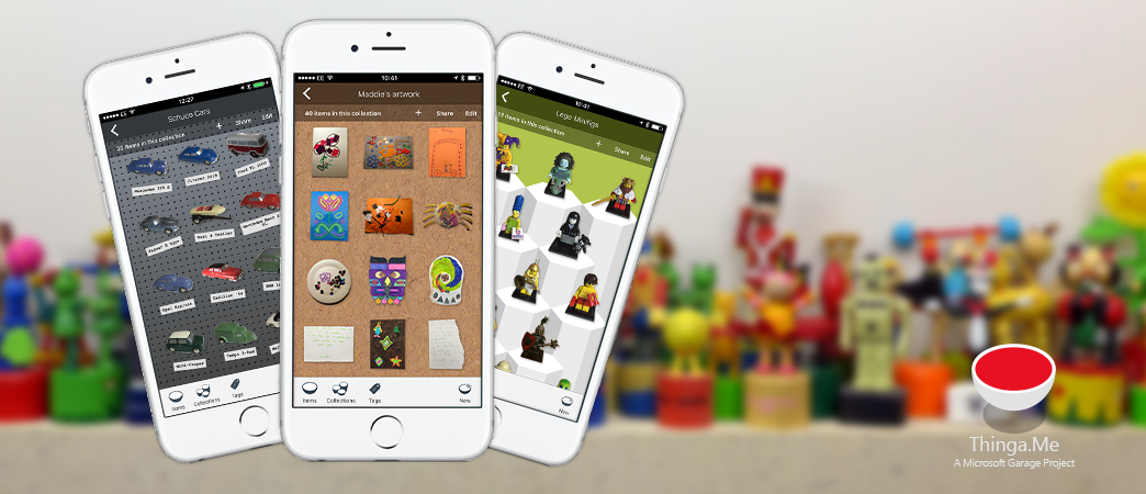
Thinga.Me was an app developed for the iPhone and released in a closed beta in the Summer of 2016 through Microsoft Garage (opens in new tab). Featuring “GrabCut (opens in new tab)” segmentation technology, developed at Microsoft Research Cambridge (opens in new tab), the app allowed people to take photos of the important physical items in their lives, quickly cut them out, and arrange them in rich digital collections which they could share with others. Building on years (opens in new tab)of research (opens in new tab) in HXD looking at the role of physical artefacts in people’s lives, the app allowed us to explore the difference between digital and physical things, and to see if we could build an experience that allowed people to create a digital facsimile of their items that they could feel proud of and attached to.

Thinga.Me in Use
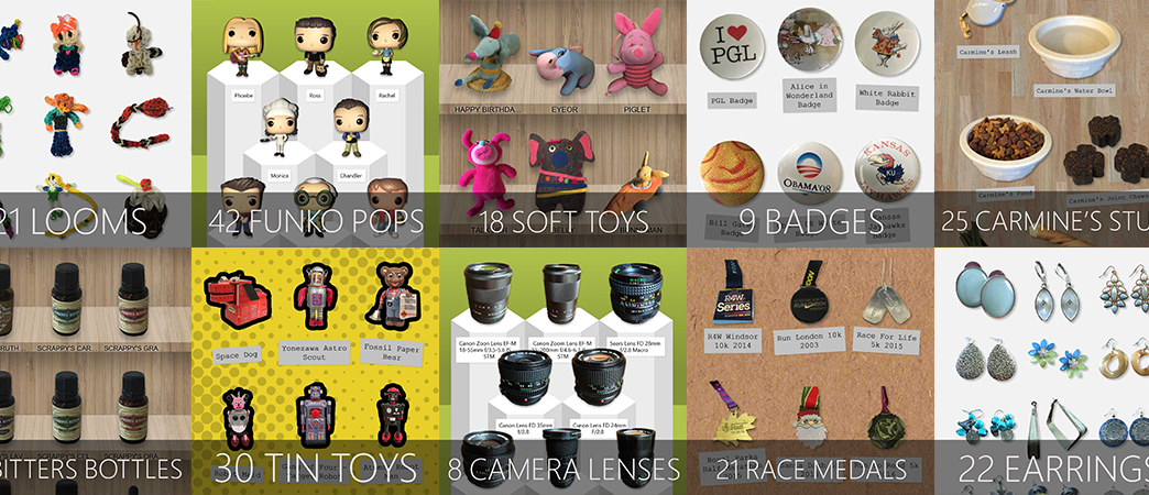
Over a period of 6 months more than 800 people used Thinga.Me to segment 5,800 items, creating 717 digital collections. Many of these are shown in the images above, which highlight how much the items in these collections feel like real “things”. The biggest focus of this collecting activity came from people with “physical collectibles” such as collectible toys, lego, vinyl records, shells and so on. “Physical possessions” formed the next largest block, with collections fulfilling a more utilitarian role, such as atchiving and inventry managements. Next came people who used the app for their “creations”, including kids artwork and homemade crafts.
During deployment we were consistently impressed by the dilligence of the app’s user community. As can be seen by the segmentation video shown further down the page, it takes effort to produce high-quality items that are cut out well, but the standard was consistently high throughout the submissions. The largest collection created was of 501 pieces of Meccano – a metal construction toy – featuring everything from individual nuts and bolts, to whole kits and adverts created by the manufacturer. That implies a great deal of time spent cutting out complex items.
Similarly, the app’s users were imaginative in their use of Thinga.Me as a tool. While many collections were of “physical collectibles”, we also had a lot of other submissions of note. One person cut out and segmented a banana peel every day at the end of breakfast, as a motivation while dieting. Another took shots of the chainsaw carvings they created and sold online. Flowers and food made up some of the more “temporary” item types, but a collection of Lego vehicles, created without a kit, and named evocatively by a young child, preserved a creative moment in and over time. One person used Thinga.Me as a tool for narratives, telling the story both of their family home, and in another collection of some family silver that had come into their possession.
The video below shows the high level “pitch” for the app, and should give a sense of the core features.
Segmentation
The key differentiator of Thinga.Me over a service such as Pinterest, for example, is both the emphasis on personal items, rather than simply content found online, and on the segmentation of objects from their backgrounds in a digital image. This act of removing the rectangle around an item helps to make it stand alone, and gives it a slight illusion of dimension and depth, making it start to feel like a “thing”. We spent much of our design and development effort, therefore, working with our machine learning based segmentation engine, GrabCut, and building the best user interaction around it possible. When someone imports an image into Thinga.Me GrabCut makes an initial attempt to segment it. The algorithm is dependent on getting a reasonable input image, though, that is well lit, and can struggle with shadows, complex patterns in the background and so on. So much of the Thinga.Me interface for segmentation focussed on allowing the user to intervene, and indicate foreground and background areas, which allows GrabCut to recalibrate.
The video below shows GrabCut and the Thinga.Me user interface in action, with both a good and a poor input image. After many months of iteration on the tools provided in the app, we’re proud of how easily our user base was able to get good results using the tool.
Themes for Digital Collections
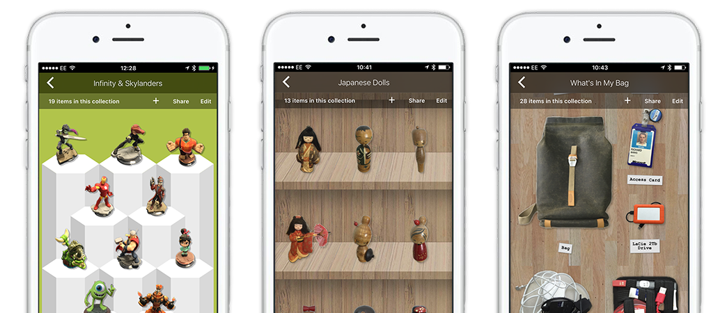
In addition to segmentation, another aspect of Thinga.Me that helped with the illusion of depth and “thinginess” in the digital items was the use of themes. The app offers a number of themes which fall broadly into two categories – those with a three-dimensional background and those that are a flat plane. In the image below you can see the two 3D themes, called “columns” and “shelves”. We were consistently impressed with the way in which people understood that by taking photos of their items from a certain angle, that matched the perspective of these two themes, they could heighten the sense of dimension in the objects shown. Remember these are 2D images, but in many of the example collections shown in the images earlier in the page the items consistently look correctly placed on their 3D background.
For 2D layout, Thinga.Me offers a number of background textures and colours, and also a variety of layouts. Below, for example, the right-hand image shows the contents of a bag, which is layed out using our “knolling” option. Knolling is a popular activity that involved laying out physical items in tight arrangements, at right angles to one another. You can see lots of examples if you simply search for the term in Bing’s image search. The app exploits these playful “celebrations of artefacts”, but in a digital context rather than physical.
The act of creating these rich visual collections seems to be a strong motivator for users of Thinga.Me. There’s a tremendous amount of satisfaction to be derived from the process of segmenting, then arranging your precious possessions into these themes, and then having them in your pocket to carry around with you. At that point, you can either simply admire or show others the things that you collect, or you can use the collection as a resource when aqcuiring more items, to make sure your new objects aren’t already something that you possess.

Thinga.Me was a great experiment, and we are grateful to the participants in our deployment for their time and effort, and for letting us gain some insight into the things they care about. We have learnt much which will be useful as we develop new concepts in the future.
人员
Richard Banks
Principal Design Manager
Martin Grayson
Principal Research Software Development Engineer
