p-Values for Your p-Values: Validating Metric Trustworthiness by Simulated A/A Tests
As members of the ExP team, we empower teams across Microsoft to run thousands of A/B tests every month. These teams use A/B tests to improve customer experiences across Microsoft’s products. For each of these tests, our automated results pipeline computes dozens, hundreds, or sometimes thousands of metrics to help each of these feature crews compare their product’s current experience (A) to a proposed new experience (B). We enable slicing these comparisons by any number of pivots such as browser, country, app version, and language. For every one of these comparisons, the ultimate decision often comes down to a single statistical concept: the p-value [1].
p-values are the bread and butter of A/B testing. In July 2020 alone, our A/B testing platform calculated over 15 billion p-values. On the ExP team, we believe that the best decisions are made when our partner teams can trust every aspect of the A/B testing system. With so many of these p-values being computed and so many high-stakes business decisions depending on them, it is critical that their trustworthiness be verified. In this blog post, we will describe one of the many methods we use to verify trustworthiness at ExP.
If you were to look up p-values in a statistics textbook, you would probably see something like this definition from Wikipedia: “the probability of obtaining test results at least as extreme as the results actually observed, assuming that the null hypothesis is correct.” When we introduce p-values to non-statisticians in Microsoft’s internal A/B testing classes, we like to frame the p-value as “If this had been an A/A test, how unusual would these results have been?”
Testing your testing system with more tests
An A/A test is an A/B test where versions A and B are identical; there is no real change to the product. You can think of them like a drug trial in which everyone is given the placebo. We still split people randomly into two groups; we just do nothing with those groups other than measure our metrics and run our usual statistical tests. An A/A test is one of the most powerful tools for testing an A/B testing platform end-to-end [2]. If your system is assigning users to groups A and B in an imbalanced way, or not assigning them at all, you could detect it with an A/A test. If your metrics’ values don’t match what you expect from other business intelligence dashboards, you could detect it with an A/A test. When it comes to testing p-values, A/A tests have one incredibly useful property: we don’t have to assume the null hypothesis is true – we know it is.
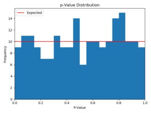
A common threshold for claiming a p-value is significant is \( p < 0.05 \). Since we know the null hypothesis is true for A/A tests, we should see p-values with \( p < 0.05 \) approximately 5% of the time. This should be true of any threshold chosen between 0 and 1: in A/A tests, p-values should fall below a value of 0.2 about 20% of the time, below a value of 0.5 about half the time, etc. This is simply another way of restating the definition of p-value from earlier. Another way to say the same thing is that p-values should be distributed uniformly between 0 and 1. We’ll see what that looks like shortly in Figure 1 below.
Of course, it’s one thing to claim something should be true, and another thing to confirm that it is true. How could we go about doing that? Well, we could just run a bunch of A/A tests until we have a large enough statistical sample. But that seems like it might put excessive strain on our A/B testing system. After all, running each of these A/A tests requires sending extra data to each of our users and processing that extra data in our logs. What if we could instead simulate the A/A test results outside the system?
Simulating A/A tests offline
Our A/B testing platform assigns users into groups A and B by applying a hash function to some unique ID. This ID could be a user ID stored in the user’s browser as a cookie, a fresh session ID generated each time they use a product, or a device ID stored locally on their PC or mobile device. We run many tests simultaneously by changing the seed of this hash function. As long as we have a set of logs which contain these IDs, we can apply this hash function to them offline any number of times, changing the seed each time, to simulate what would have happened in real live A/A tests. After that, we can calculate the p-value for each of our A/B testing metrics in each of these simulated A/A tests.
Let’s go ahead and simulate a few hundred of these A/A tests for one of our partner team’s metrics. In this case, we ran the simulation 200 times (we have found that 100 simulations are generally sufficient, but more simulations produce nicer graphs) and made a histogram of the p-values. For a healthy metric with no major issues, here is what that looks like:


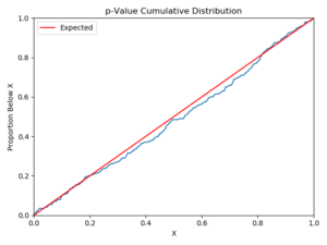
Figure 1 – A histogram (left) and cumulative distribution (right) of 200 p-values for a metric taken from simulated A/A tests. This metric does not show any major data quality issues, and the p-value distribution closely matches expectations.
For our healthy metric, the p-values are distributed pretty evenly between 0 and 1. We expect about 10 of the 200 to fall below 0.05, and we see 9. There is a bit of a spike and a dip near \( p=0.5 \), but it’s well within the normal range of variation. It can be a bit difficult to see how good a match the distribution is by looking at the histogram alone, so we prefer looking at the cumulative distribution on the right. Of course, when analyzing dozens or hundreds of these graphs, visually inspecting each graph would be both tedious and subjective. Instead, we use the Anderson-Darling statistical test [3], which itself produces a p-value, to see if the distribution deviates significantly from a uniform one. Before you ask, yes, we also checked to make sure the Anderson-Darling p-values were uniform under the null hypothesis. You’re not allowed to do a meta-analysis without getting meta. As we will see below, the metrics which fail this test fail it in a very big way, so we can get away with a pretty low p-value threshold to avoid false positives. Now, let’s repeat this for another metric:


Figure 2 – Same as Figure 1, but for a metric affected by a single large outlier. Note the spike in the p-value distribution at p=0.32
The results we see in Figure 2 are certainly…unexpected. In 200 of these simulated A/A tests, this metric never even came close to showing a statistically significant result. All 200 of these p-values are clustered around 0.32. What could cause such an outcome? It turns out, this is what you see when a metric is affected by a single large outlier. In this case, a click event had been mistakenly duplicated many times in our logs. While most users were clicking on a link between 1 and 10 times in the one-week period we looked at, one user had over a million of these duplicated clicks. No matter how we split the user population into two groups for our simulated A/A test, this outlying user always makes it into one of the groups. This outlier inflates the mean and variance for the metric and forces the t-statistic to be very close to 1.0 in every single A/A test. If you have taken a statistics course, you were probably forced to memorize the so-called “68-95-99.7 rule” [4] to remind you that 68% of a normal distribution falls within 1 standard deviation of the mean. That’s where our p-values of 0.32 are coming from. By forcing the t-statistic to be close to 1.0 in every A/A test, the metric value is always approximately 1 standard deviation from the mean. And if 68% of a normal distribution falls within that range, 32% must fall outside it.
Detecting A/B issues in an A/A world
Let’s reflect for a moment on what we just did. We detected a problem with one of our A/B testing metrics by simulating A/A tests on our logs offline. We didn’t even know we were testing for outliers, but we found one. This outlying user was also present in every A/B test we ran during that period, affecting the p-values there as well. There might have been a real statistically significant movement in this metric that we would have missed because of this outlier. Let’s look at another unhealthy metric and see what else we can find.


Figure 3 – Same as Figure 1, but for a metric affected by two large outliers of comparable magnitude. Note the two spikes in the distribution.
This metric’s diagnosis is actually pretty similar to the previous one. This is what happens when you have two large outliers instead of one. The peak on the left is what happens when both users get assigned to the same group in the A/A test and the peak on the right is what happens when they get assigned to two different groups. By changing the relative magnitudes of the two outliers or adding a third, you can shift these peaks around a bit, but it generally always follows this kind of multi-peaked pattern. Of course, once you add enough outliers, it is hard to call them outliers at all, and above 30 or so of these large values, the p-value distribution starts looking flat again like in Figure 1. There is nothing special about the number 30 here, this is just the usual statistical rule of thumb that 30 samples are sufficient for the central limit theorem [5] to be applied.
In cases like these where outliers are strongly affecting the distribution of p-values, we recommend that our A/B testing partner teams truncate (or cap) their metric distribution. If a user had a million clicks, it is unlikely that this was caused by your A/B test. Instead, you can pick a sensible upper bound for click count, maybe 50, and replace all click counts greater than 50 with that value. This kind of truncation greatly improves metric sensitivity. Let’s look at one more unexpected metric in these A/A tests:


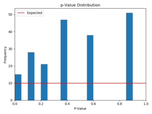
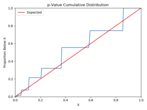
Figure 4 – Same as Figure 1, but for a metric which measures an extremely rare event. Note the few discretized spikes in the p-value distribution.
Okay, what is going on here? In 200 A/A tests, this metric only showed 8 different p-values. How could that be possible? As it turns out, this is a case where the metric is measuring occurrences of a very rare event. In the one-week period we looked at, only 15 users performed the action this metric was trying to measure. There are only 8 different ways to split these 15 people into two groups, from 15-0, 14-1, etc. down to 8-7, so we only get the same 8 p-values again and again. For this kind of metric, the only real solution is not to measure the metric at all, or at least not to view it as reliable. There simply are not enough users performing this action for the A/B testing system to detect meaningful results for this metric.
These three cases above are the most frequent issues we have encountered using this method. There is one more case that’s almost too trivial to mention, which is the case where a metric is defined such that it’s always 0 or always 1 no matter how you split the population. In an ever-changing product, you are bound to end up with metrics like “Count of impossible actions per user” or “Proportion of users who satisfy a tautology” somewhere along the way. These metrics don’t have interesting graphs like those above – their p-values are always 1 (or undefined, depending on how you like to divide by zero).
After running this analysis against all of the A/B testing metrics of around a dozen Microsoft products, we have found that the typical product has 10-15% of their metrics failing this test for uniformity under the null hypothesis. For some, the failure rate was as high as 30%. It is important to run checks like these on a regular basis. Just because a metric passed the tests this week doesn’t mean it isn’t susceptible to outliers in next week’s data. Based on these results, we are working on ways to automate this test and notify our partner teams when their metrics are showing these kinds of issues.
On the ExP team, trustworthy analysis is one of the key pillars of our platform. There is nothing more fundamental to the analysis of A/B tests than the p-values we produce, and this kind of analysis is just one of the many ways we are working to ensure the trustworthiness of our metrics. We will be talking about other ways by which we ensure metric trustworthiness in an upcoming blog post.
– Carl Mitchell, Andy Drake, Jonathan Litz, Garnet Vaz, Microsoft Experimentation Platform
[1] https://en.wikipedia.org/wiki/P-value (opens in new tab)
[2] R. Kohavi, D. Tang, & Y. Xu. (2020). Chapter 19: The A/A Test. Trustworthy Online Controlled Experiments (pp. 200-208). Cambridge University Press.
[3] https://en.wikipedia.org/wiki/Anderson%E2%80%93Darling_test (opens in new tab)
[4] https://en.wikipedia.org/wiki/68%E2%80%9395%E2%80%9399.7_rule (opens in new tab)
[5] https://en.wikipedia.org/wiki/Central_limit_theorem (opens in new tab)

