By Michele McDanel (opens in new tab)

Image Credit: iStock
The internet browser has become the primary way we work, learn, and discover. With people now spending an average of six hours and 43 minutes online each day, the need for a secure, productive, and compatible browser is greater than ever. Last year, we started rebuilding the Microsoft Edge browser and after a year-long journey, we launched the browser built on the Chromium open-source engine.
As the web continues to grow in complexity, we see an opportunity to improve the web and users’ experience of it by building new capabilities into a shared open-source project.
Driving impact is more than just building great products. It’s about understanding your customers to bring them the best possible experiences. User research provides us with the ability to engage with, learn from, and empathize with our customers. Through user research, the Edge team introduced (opens in new tab) new functionalities in both vertical tabs and tracking prevention. Let’s look at those improvements, and how research informed them.
Building vertical tabs
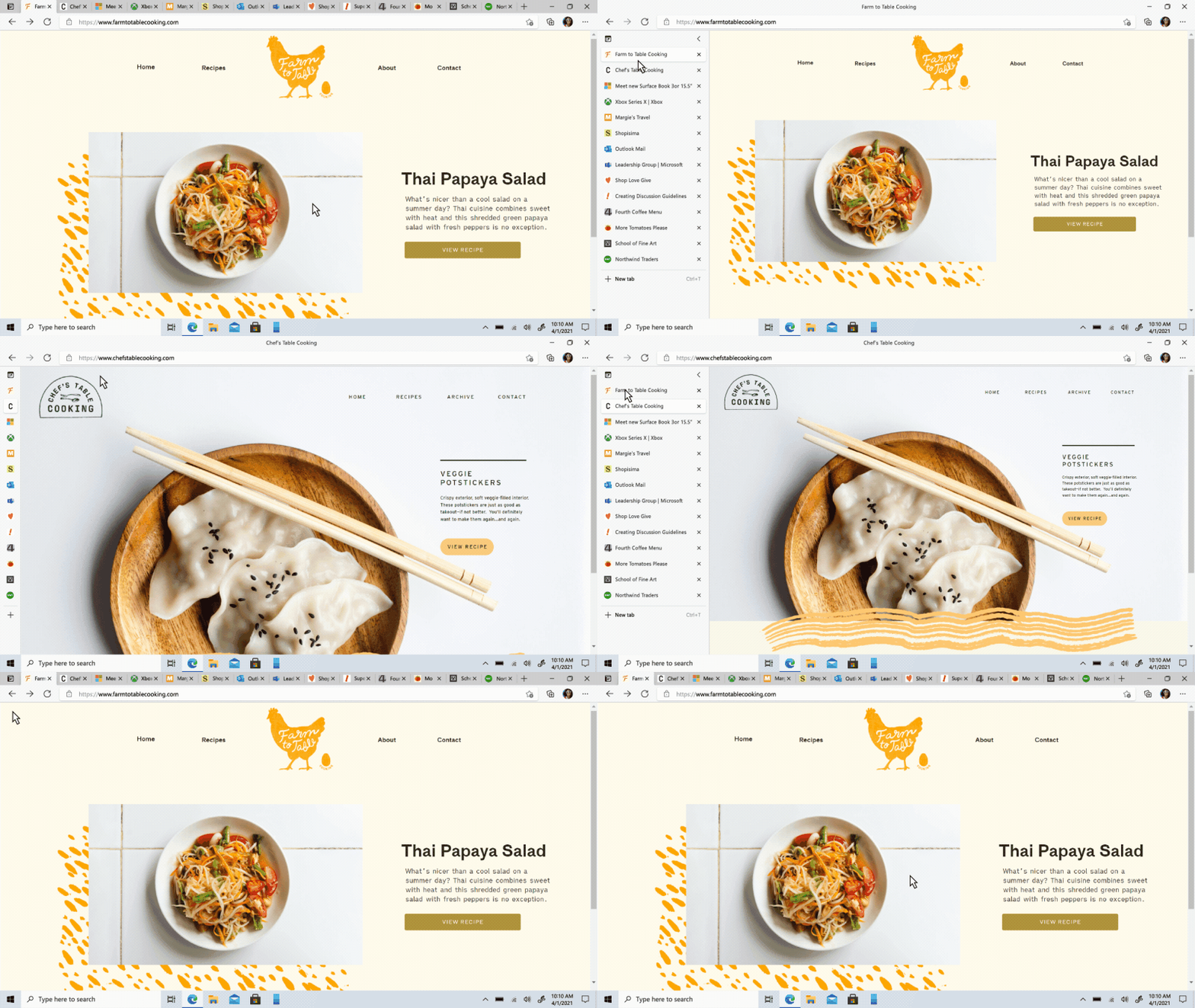
Managing tabs has been a persistent pain point for our users. One developer told us about his experiences with managing 200 open tabs, describing it as ‘mental gymnastics’. With that much open on the screen, the individual tab titles become lost, and favicons are the only thing users can see. To create more space, some users resorted to opening multiple browser windows.
“Some people are very rigorous about only opening tabs they need and closing them when they’re done. But others accumulate dozens of tabs and keep them open for weeks or months at a time,” says William Devereux, a Senior Program Manager on Edge. “For these users, it can be incredibly difficult to find the tab they’re looking for.”
Most websites follow a conventional grid that leaves plenty of whitespace on either end of the page. As we began working with our users, we realized that this vertical real estate could be a better location for tabs, rather than the traditional horizontal list of tabs at the top. While vertical tabs may not be an entirely new concept, we saw an opportunity to improve the browser experience and tested several prototypes with our users.

After listening to our users and consolidating our findings, we came upon some important considerations for the next iteration.
• A visible feature button: We learned that many users like to switch between horizontal and vertical tabs, depending on the number they have open. Users needed a visible toggle, rather than one hidden under a setting. We adjusted the placement of the vertical tabs button to increase discoverability and efficiency.
• A cohesive color palette: When we first began prototyping, we were using the same color as the horizontal tab-band. But our users noted how vertical tabs appeared dark and heavy. So, we lightened their color to make them feel more cohesive with the rest of the browser UI.
• A collapsible pane: Some users expressed the need to focus or temporarily regain more screen real estate without losing the benefits of vertical tabs, especially on smaller monitors. To address this, we added a collapsed pane functionality, which enables users to see more of the web while still providing access to their tabs.
Giving users more control over their privacy
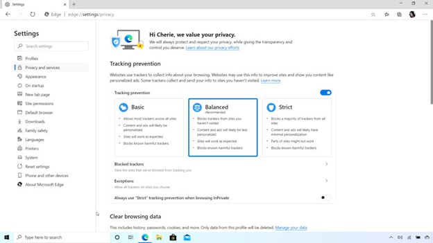
The new Microsoft Edge is designed to detect and block known third-party trackers by default. Through our tracking prevention feature, you can choose from three levels of tracking prevention—basic, balanced, and strict. We’ve done a lot to expose that control directly in Edge, so our users are empowered to make the privacy decision that best fits their needs.

Many improvements to tracking prevention were informed by user research. One important change was how we describe each level of tracking prevention. We found that many users were confused by the language in the descriptors and wanted to know what it meant that some websites ‘might not function properly.’ They wanted the language to be more direct and transparent about how each setting impacted their privacy, their data, and most importantly, their experience on the browser. To that point, we added contextual help onto our settings page, with the goal to reduce confusion and provide assistance as needed.
Tracking prevention, among the suite of privacy features on Edge, empowers our users to ‘do more’ by putting them directly in control of their privacy decisions and providing them the transparency they asked for.
What’s next?
This process began with an emphasis on our users and their needs. As we continue to roll out new features and improve upon existing ones, we will continue to look to them to inform where we go next.
Research enabled the Edge team to listen to our customers, and carefully align their needs and goals with the core value of our product. Based on the insights gathered, we’ve started looking into the future of Edge with an exploration of the core interactions on a browser: favorites, history, and other aspects of the frame and menu. We believe there is more opportunity for new and innovative ideas that other browsers have not yet explored.
We’re excited to start that race.
Thank you to Olya Veselova, William Devereux, Lillian Kravitz, Patrick Evan Little, Kristen Warren, Josh LaMar, Sara Hefny, and Joshua Tjong for contributing to this article.
What do you think? Are you excited about the changes in Edge? Tweet us your thoughts at @MicrosoftRI or follow us on Facebook (opens in new tab) and join the conversation.

