UX enhancements to model-driven Power apps on mobile
The new Power Apps app plays your canvas and model apps in one single mobile app. In conjunction, we’re thrilled to introduce a brand new, responsive UX designed specifically with mobile scenarios at heart.
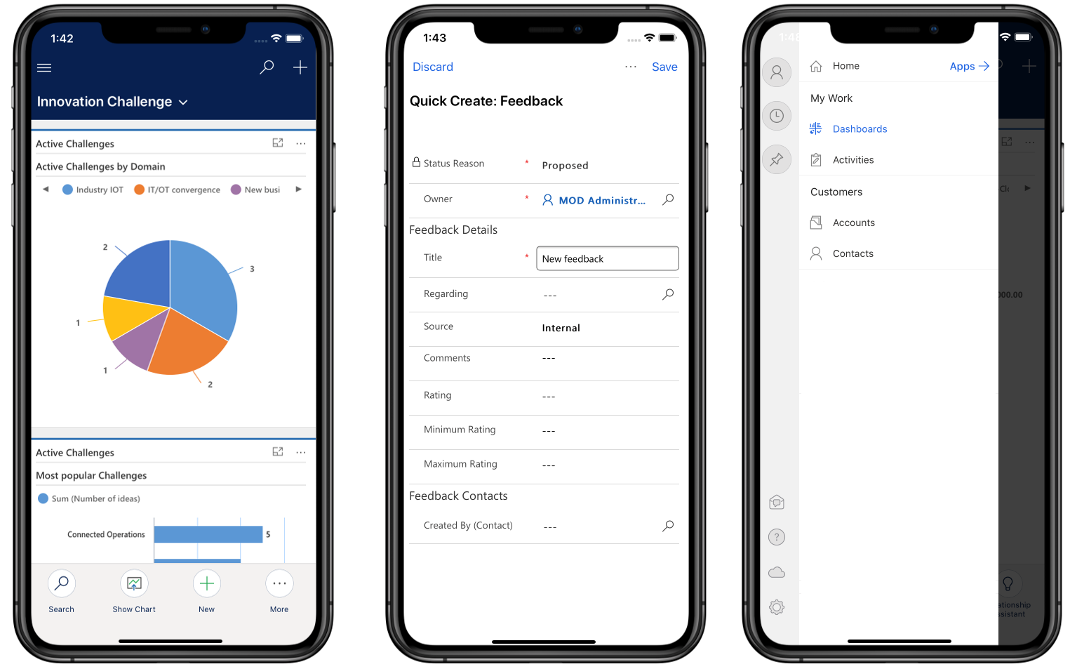
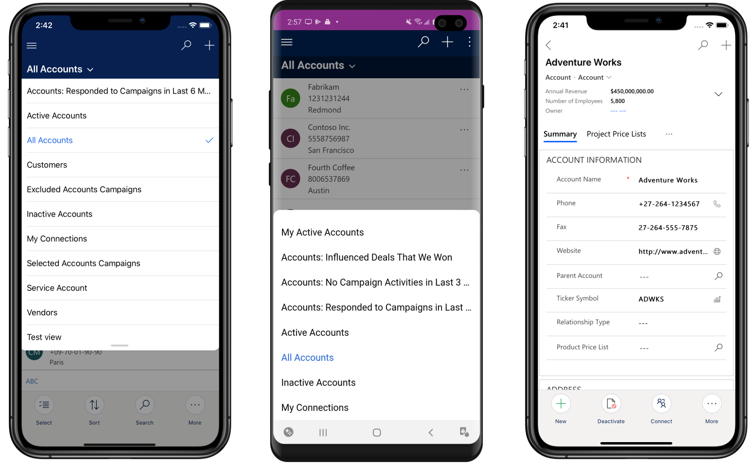
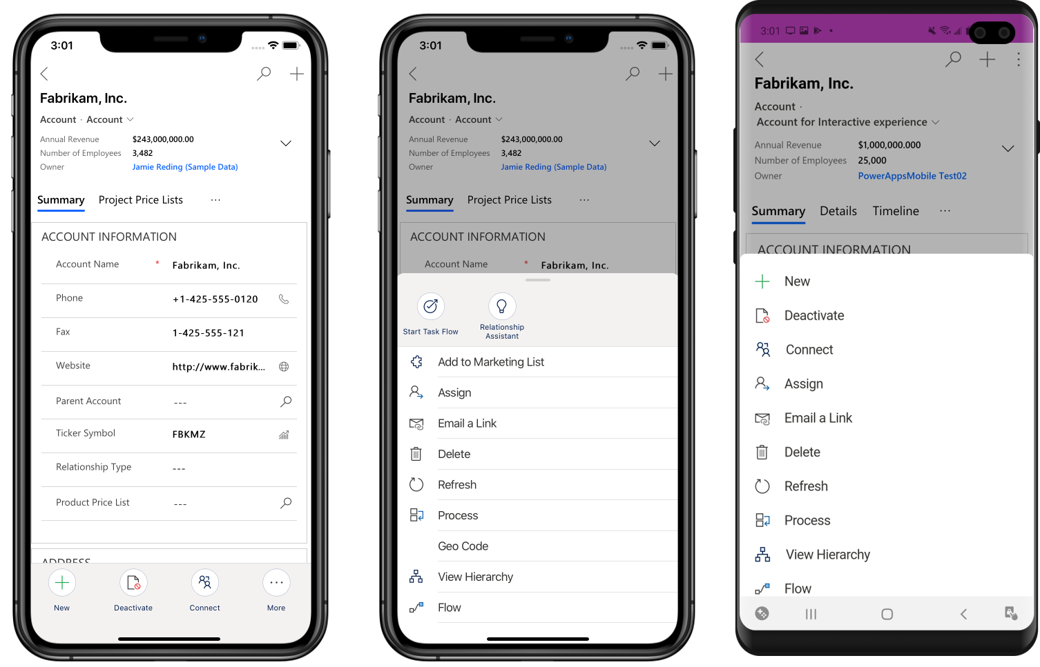
Model-driven apps’ UX supports the need for taking quick actions on your information, in a familiar and recognizable way on mobile. Usability enhancements to some of the core components of unified interface brings your model apps to life on mobile with a native look and feel, gesture support, updated animations, and interaction patterns that are intrinsic to mobile. With tailored differences in UX for iOS and Android phones, model-driven Power Apps look and feel like any other mobile app on that platform.
Prominent header
- The hamburger menu on the top left corner houses the sitemap, with Search and Quick Create options on the top right – discoverable on all pages.
- Sitemap is a slide out panel, a common mobile interaction pattern, that is a window into the different navigation options for the model app. It has a cleaner layout, with emphasis on your content.
- Quick Create enables you to create a record in context, with optimizations to Save and related options.

Navigation
- You can tap on the view name on a list page to switch views easily using the updated view switcher.
- Updated page transition animation enables you to navigate back by swiping across the screen. On Android phones, you can use the device’s soft back button to go back to the previous page.

Commanding
- You can find page-level commands on any page at the bottom of the screen. On iOS, they are circled icons with stacked text. On Android phones, they are under the floating button at the bottom.
- Global commands are in the overflow drawer on iOS as a horizontally scrollable list and in the vertical ellipsis in the header on Android phones.

Please review the documentation for more details and share your feedback on PowerApps community forum.
