How Azure Maps can help you unlock location intelligence in Power BI
As organizations realize the value they can unlock from analyzing location data, adoption of location analytics has been surging. In Forrester’s 2023 Data and Analytics Survey, nearly 90% of data and analytics decision-makers said that their organization is currently focusing on building location intelligence (LI) capabilities or will do so in the next two years. A few of the challenges organizations face as they try to adopt location intelligence include:
- Lack of skills or expertise: Organizations require more practitioners who can understand and effectively leverage location data for business insights.
- Data integration: Incorporating location data with other business data is critical for extracting meaningful insights and can be challenging due to disparate tools.
- Data quality and standardization: Organizations must ensure that all location data that they use is accurate and collected while adhering to all data privacy and other regulations.
Azure Maps Power BI visual
Learn more.To help our customers easily access the benefits of location intelligence, we introduced the Azure Maps visual in Fabric, specifically to Power BI, in 2023. Azure Maps enables users to visualize and analyze their location data on maps to uncover patterns and trends. Using it is as simple as enabling the Azure Maps Power BI visual, selecting the Azure Maps icon from the visualizations pane in Power BI, and then diving in to enhance your dashboard with location intelligence. Azure Maps in Power BI comes with a range of capabilities to help you better optimize your data including geocoding, reference layers, traffic layers, and more.

Azure Maps for Power BI
Build intelligent location-based experiences for applications across many different industries
Geocoding is the most fundamental step in location intelligence and entails converting addresses into latitude and longitude points. For example, a retail store can use the geocoding capability to visualize where their customers are located and determine which postal code, state, and or country has the maximum concentration of their customers. In Power BI, geocoding comes to life when a report creator drags their address data into the “Location” field in the format pane. Addresses are then automatically converted into geographic coordinates and placed on a map. Alternatively, if you already have georeferenced data, then you can drag data directly to the “Latitude” and “Longitude” fields to see it on a map. Currently, the Azure Maps visual supports geocoding for up to 30,000 data points in a single visual. Learn more about geocoding here.

Reference layer is another capability offered by Azure Maps that enables Power BI report creators to add an additional data layer on top of their maps to gain deeper location-based insights. For example, an insurance company can overlay natural disasters data such as historic wildfires or flood occurrences on top of their clients’ locations to understand how risk-prone their clients are and then use those insights to determine the insurance rates for those customers. Azure Maps enables users to incorporate data from multiple sources, including: GeoJSON, KML, WKT, or SHP formats. In the July 2024 update for Power BI, we also introduced data source support for CSV files and dynamic URLs Learn more about reference layers here.

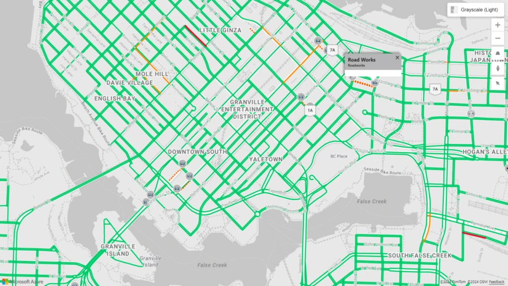
Traffic layers enables Power BI report creators to overlay real-time traffic data on maps within Power BI by turning the traffic layer slider in the format pane on. By selecting “Show Incidents,” you can visualize traffic flow and incidents such as road closures and construction on the map. Logistics companies often overlay their telematics data and then use traffic layers to optimize their routes. They can determine where potential delays in deliveries can occur or where incidents such as harsh breaking are likely to take place. Learn more about traffic layers here.

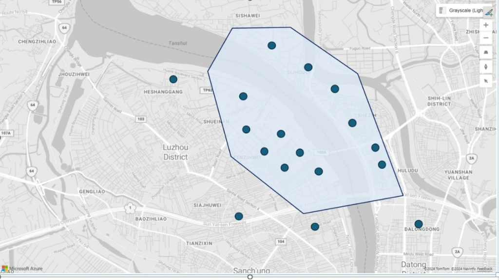
The Range Selection capability enables means report creators to can place a pin on a map and define a search area either by time or distance. For example, a coffee chain trying to open a new location in the downtown Seattle area can use the “Distance” metric to determine how many other competitor coffee shops are within a two mile radius of the city-center. Alternatively, the coffee chain can use the “Time” metric to determine how much time it will take for their target customers to reach the coffee shop from a given location. With these location-based insights, the coffee chain can make informed decisions ranging from determining where to open the next store, to analyzing store performance, or to planning for inventory to meet customer demands. Learn more about range selection here.

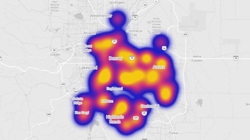
Azure Maps visual also includes other data visualization tools that help report creators in impactful storytelling. Heat Maps, also known as Density Maps, are a type of overlay on a map used to represent the density of data using different colors. Heat maps are often used to show the data “hot spots” on a map. Heat maps are a great way to render datasets with large number of points. For example, a heat map can be created to identify the frequency with which customers visit shopping centers in different locations. Learn more about heat maps here.

Learn more about the Azure Maps visual in Fabric
We are constantly updating the Azure Maps feature to improve location intelligence within Power BI. Upcoming updates for Azure Maps visual will include more location data visualization and intelligence capabilities. As businesses continue to embrace data-driven decision-making, the combination of Azure Maps and Microsoft Fabric will play a crucial role in unlocking the full potential of location data.
To learn more about Azure Maps visual and to get started, visit our documentation page.


