Announcing Office Sway: reimagine how your ideas come to life
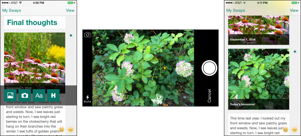
Today we’re introducing a brand new app to the Office portfolio. Say hello to Sway! Sway is an entirely different way to express yourself and bring your ideas to life. When your ideas are born, you want to explore, visualize and share them—quickly and easily, wherever you happen to be, and on whatever device you have. You want your ideas to be understood. Sway helps you do just that. It’s a new way for you to create a beautiful, interactive, web-based expression of your ideas, from your phone or browser. It is easy to share your creation and it looks great on any screen. Your ideas have no borders, edges, page breaks, cells or slides. Your mind is a continuous canvas, and Sway brings this canvas to life. Sway helps you focus on the human part: your ideas and how they relate to each other. Sway takes care of the design work—a Sway is ready to share with the world as soon as it is born. With today’s announcement and Sway Preview, we are just starting our journey with Sway and want you to help us shape its future. Today, we’re thrilled to kick things off by introducing:
Create and share something new
A “Sway” is what we call the canvas you create using Sway, and it’s much more than a document in the traditional sense. It’s built from the ground up for the web and devices. A Sway adapts to fit the device that it’s viewed on, large or small, so your ideas always get the best treatment. A Sway is cloud native: you just drop in your content from your cloud storage, your devices or your social networks.
Give this embedded Sway a try! Just swipe, scroll, tap and click to experience a Sway—an interactive, web-based canvas that brings your ideas to life.
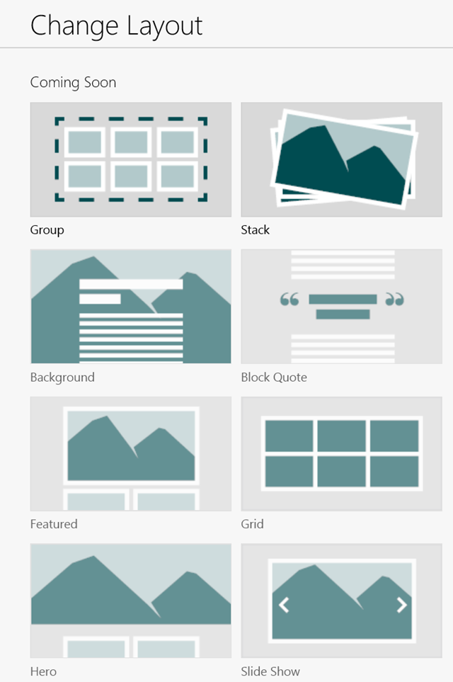
Sway can also make your creations interactive, so you can engage your audience with your content—such as photos—in new, more meaningful ways. For example, select a few of your photos from OneDrive or Facebook, click Layout and you can turn them into an interactive photo stack that people can tap to sift through. And that’s just one example—there are a lot more to come!


Add your content easily
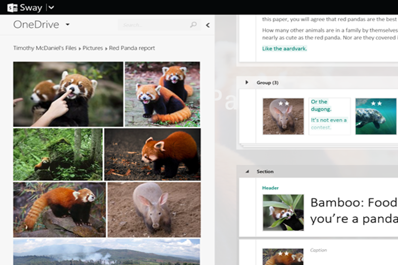
It is easy to collect your content from a variety of sources right within Sway. Sway shows you the stuff you have stored in the cloud: just tap or click, drag, and drop it right onto your canvas. Built-in content sources include OneDrive, Facebook, Twitter, YouTube, your devices, or even embeds for your other content (coming soon!). And we’ll be growing that list over time.


Effortless design
The magic of Sway really shows as you’re creating a Sway. Sway’s built-in design engine takes the hassle out of formatting your content by putting all of it into a cohesive layout as you create. This means that from the first word, image, Tweet, or graphic you add, your Sway is already being formed for you. This is thanks to a lot of Microsoft Research technology we’ve brought together in the background. As you add more of your content, Sway continues to analyze and arrange it based on the algorithms and design styles we’ve incorporated. You can adjust and customize the format Sway has created in easy and intuitive ways. Want a picture to stand out? Don’t worry about exact pixel heights and widths or whether you have the design chops to keep things looking good. Just tap or click the image in your Sway and tap or click the star icons to emphasize it. Sway takes your natural feedback and works its magic almost instantly. Want to rearrange your ideas? Just drag and drop any set of your content where you want, and watch your Sway react. This type of simple guidance from you helps Sway understand how your different ideas relate to each other. Sway uses your input to update the look of your creation accordingly and adapt it to display appropriately across devices. This means your Sway always looks great—even when you’re building it on a mobile device and others are viewing it on a desktop.


Sway’s dynamic nature also means you can match the way your Sway flows to how you want to share your ideas. Sway offers a traditional linear, scrolling vertical layout and a fun horizontal one to pan through too. But maybe your ideas need something a bit different. For example, there is a high-level concepts structure that gives section overviews before jumping into the details. There’s a flashcard layout where you can flip over digital cards to see their details. You can pan and zoom over a single flat 2-D canvas, or fly in 3-D. Sway lets you personalize and share your ideas in a way that makes the most sense to you. And, if you feel adventurous, give the Remix! button a try to see what layout and style Sway suggests. Your content is still safe, and you can always Remix! again.
Is Sway for me?
Ultimately, Sway will help people quickly create and share their polished, interactive content for all sorts of uses. Whether you’re a student pulling together your digital report on the red panda, a professional compiling an annual shareholder report, or a do-it-yourselfer sharing your woodworking expertise, Sway can help get you up and running quickly with something polished and presentable that expresses your ideas. Keep checking out Sway.com for more inspiration!


Click above to see a Sway example. More available at Sway.com.
Take a closer look at Sway by watching this Garage Series for Office 365 episode, with host Jeremy Chapman and David Alexander. Jeremy also catches up with the lead engineer behind Sway, Chris Pratley, to learn about the backstory and vision of Sway.
Sway Preview is a partnership—we want your help!
Sway is completely reimagining how people bring their ideas to life. Now that we’ve told you something about the direction Sway is heading in, we’d love for you to help shape that future by working closely with us during Preview while we continue building Sway. Request an invite at Sway.com. Then tell us what you like, what you don’t like and what you want to see us add. We’ll be listening closely so we can help make Sway better for you and everyone else! In the meantime, anybody can share Sways. While we prepare your invitation to Sway Preview, check out any of the Sways above and at Sway.com and give the Share button a try! Help us spread the word and share a Sway you find interesting.
Sway and the future
We’ve worked hard to make Sway ready to assist you with the design of something new and creative, and to help you get your content into Sway more quickly. We have so much more planned. We’ll do more of the basics of course, such as hooking up to more sources for your content, offering Sway in more languages, providing more styles and layouts, and giving you even more fine grained control over your output. We’ll expand the set of business-specific features, too. A few examples include OneDrive for Business and SharePoint connectivity, integrating the Office Graph, and capabilities for information protection and IT management. We’ll continue to add new delights we hope you’ll realize you never could live without. This is just the beginning. Visit Sway.com. Let’s shape the future of productivity together. Sway on!
Sway team, @Sway


