Introducing SharePoint 2013 Search Result Types and Display Templates
Hello everybody! My name is Kate Dramstad, and I’m a Program Manager working on the SharePoint search team. I’ll be talking to you about improvements in the SharePoint 2013 search experience. This post is a high-level overview of how result types and display templates work together to create rich search experiences. If you take away only one concept from this post it should be: Result Types + Display Templates = Rich Search Experiences.
Creating a great search experience
A great search experience is characterized by how easy it is for the user to quickly find what they are looking for. In most search UI, all of the search results look the same, so it is up to the user to carefully scan each result, or worse, to “pogostick”—jump back and forth between the results page and a result trying to decide if that particular result is what they were looking for. In an ideal search experience, the user should be able to click only once, feeling confident they have found what they were looking for.
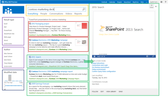
SharePoint 2013 offers a huge improvement in the search experience through display templates and result types. Gone are the days of uniform-looking results and endless scanning. Documents aren’t all the same, and search results shouldn’t be either. In SharePoint 2013, you have the ability to control the look of the search results on a very granular level. Take a look at this screenshot below. Each colorful box represents an area of the UI that’s being controlled by a different display template.

There are display templates for each of the different results types within the search results, the hover panel for each result type, and each of the refinement controls. Each of these areas can be customized so that you can deliver a search experience that will delight your users.
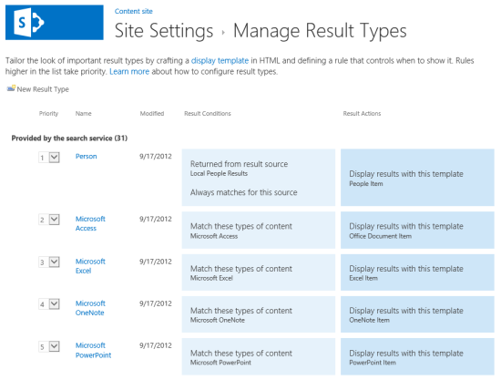
A result type consists primarily of a set of rules that describe which of the items in the search results match that result type. When a user issues a query, the results come back and each result is evaluated against the rules in the result types. A display template is then applied to the result based on the type that it matches. By default, SharePoint 2013 includes several predefined result types:
- Rich document results for PowerPoint, Word, and Excel documents
- Rich conversation results for Newsfeed posts, replies, and community discussions
- Rich video results, and more…
Each result type has its own display template, making it look different from other result types and surfacing properties that are most relevant to a specific kind of document.

In addition to the default result types, you can define your own result types. A result type can then be associated with a custom display template, enabling you to highlight specific kinds of results that are important for users. For example, let’s say when users search for purchase orders, you’d like the search results to also display the person who approved the purchase order for each result. To accomplish this, start by creating a custom result type for Purchase Orders. In your company, purchase orders are Word documents with a property IsPurchaseOrder, along with some other additional metadata like Purchase Order Approver, Purchase Order Approval Date, and Purchase Order Cost. To create a Purchase Order Result type, you would copy the Microsoft Word Result Type and add a specification that results that match should have the custom property IsPurchaseOrder equal to “True.”
The next step is creating a custom display template for Purchase Orders that surfaces the managed property POApprovedBy. Customizing display templates is straightforward. All customization is done in HTML and JavaScript, rather than XLST. To create a new template, start by copying an existing template. Add additional managed properties to the template so that you can surface important type-specific information. In the case of the Purchase Order example, copy the Word Item template and add the OPApprovedBy managed property to the template. Next, style the UI with HTML, JavaScript, and CSS.
The final step is to tell the Purchase Order result type to point to the Purchase Order display template. Now when a user issues a query, each result is first evaluated against the rule for Purchase Order results. If it matches, it is displayed using the Purchase Order display template. Otherwise, it is matched to one of the default result types and is displayed using the corresponding template. With this new search experience, you have made it easier than ever for users to find what they are looking for. But wait, there’s more!
As I mentioned earlier, display templates offer control over many aspects of the search UI, not just the result types. If you wanted to extend our Purchase Order example further, you could, for example, create a refiner for Purchase Order Cost using the Slider with Bar Graph template that is used by the Modified Date refiner by default. Or, you could create a custom hover panel that surfaces even more properties that are specific to Purchase Orders. The possibilities are basically limitless.
In my next blog post I’ll cover the code-level details about how search administrators can create custom result types and display templates. I hope this post got you thinking about scenarios where custom result types and/or custom display templates can help deliver a delightful experience for users. I look forward to hearing your comments.
